Timeline
7 Weeks
June 22 – August 7, 2015
Context
athenahealth's Quality Management Reporting (QMR) product needed a cosmetic – and slightly functional – overhaul to refresh it based on user feedback. The cosmetic piece involved updating the UI from the company's old design language to its new one that was being rolled out across various products.
Shortly after beginning the project, I realized that the QMR was very similar to two other analytics/reporting products intended for different users and use cases. The project quickly became a merging of three similar products into one unified analytics and reporting platform. The processes and images below focus primarily on the QMR as this was my task, but they apply to the merged three similar products as well.
Problem
It often crashes, and we're a big client with a lot of data.
The current QMR could not handle large amounts of data. To solve this problem, we needed to be intentional and intelligent with what we immediately loaded for the user. We decided to show top-level actionable information that users could dive into for more specific and in-depth analytics.
There's no built-in business intelligence.
Users didn't want to dig for the actionable information. We decided to bring the actionable information to drive decisions up to the surface, leaving the backing data retrievable underneath. This led us to redesigning the QMR in a drill-down oriented fashion.
It's hard to understand and compare numbers, and it's frustrating to have to manually find them each time.
We found that users needed to compare data side-by-side, i.e. look at multiple doctors' performance at the same time. We needed to provide users with a way to build comparisons in a way that made sense in our drill-down design while providing users with a way to quickly access them from anywhere within the QMR. This led to the design of the "Priorities Bin" (more below).
Process
Identify User Stories and Goals
The first step of the process was identifying the key QMR users and what their goals were. I utilized personas created by the UX team for use in all projects to gain a better understanding of QMR users, and I determined what each of these users need to be able to do with the QMR.
I mapped out the users and their goals, and identified the six most crucial user-goals that needed to be met out of the list of approximately 20 user stories that I had created.
Gather Inspiration
With the six goals that the QMR had to accomplish, I set out to gather data visualization design inspiration. I looked for interesting and engaging data visualizations that could help reach the goals of the project in meaningful way. I found interactive pie charts and graphs that compare against one another, a venn-diagram style chart with multiple levels of statistical granularity, and many dashboard elements used for data monitoring.
I also looked at several different products within the company to see what design decisions they had made. I talked with designers working on these projects to gain an understanding of why they made certain design decisions and what feedback they received.
All of the pieces of inspiration that I gathered helped me expand my design expectations for the project; I pushed myself to design a QMR that would not only deliver what users needed, but that would make their tasks easier, more engaging, and more productive.
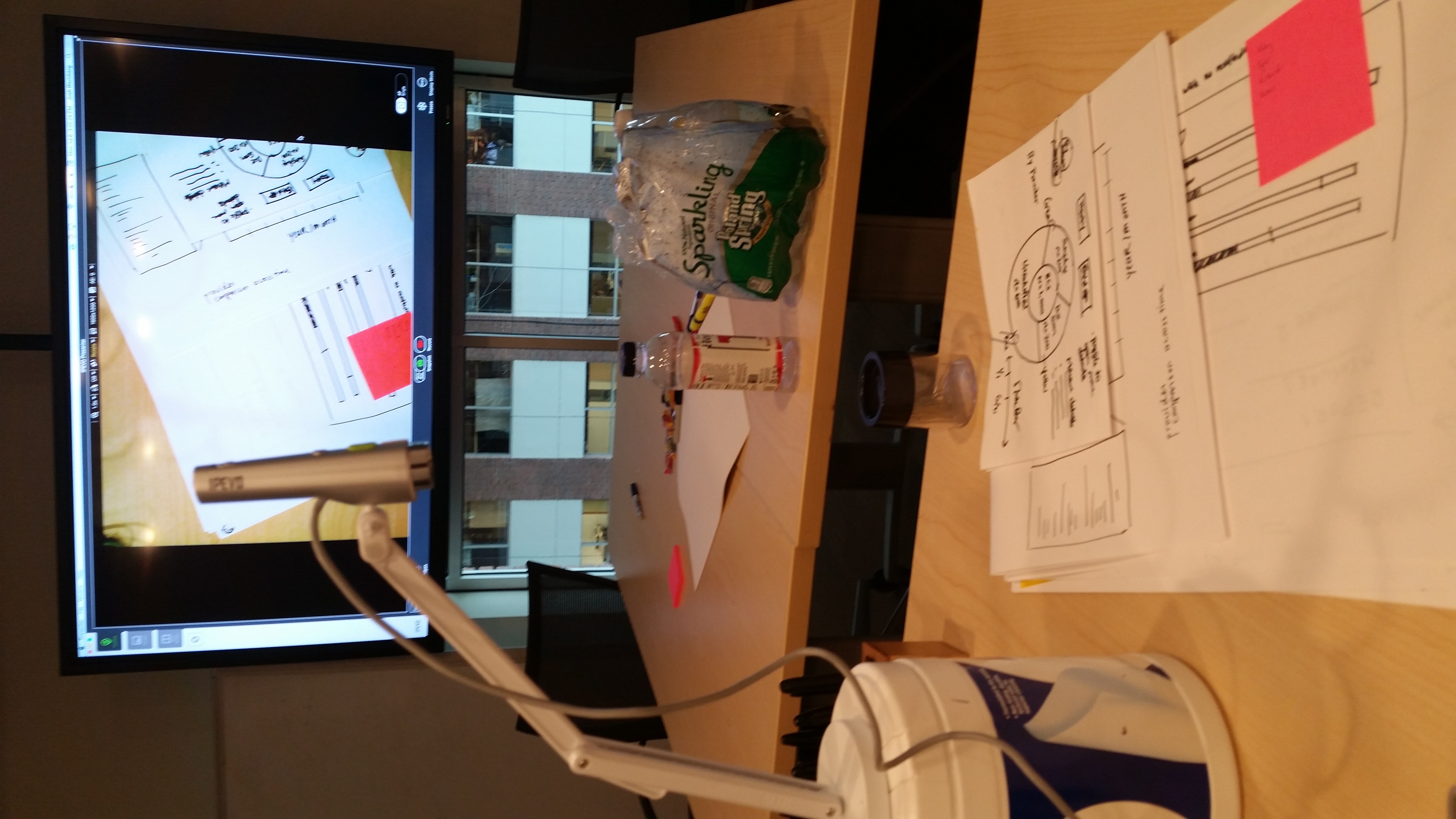
Initial Wireframes and Designs
Once I gathered enough inspiration to feel like I could start putting ideas on paper, I sketched dozens of design ideas for a host of different product features. I sketched out the project's navigation menu, chart types, analysis tools, and key design elements while determining an appropriate information hierarchy. In healthcare, there is a tremendous amount of information, so identifying what information was truly actionable - while being confined to what was programmatically possible regarding the company's information architecture - was crucial for delivering a product that help our users make decisions quickly while being as informed as possible.
During my process, I decided that alongside the static structure of the analytical drill-down elements, there needed to be a dynamic element that stayed with users no matter where they were in the QMR. This would allow them to identify certain pieces of information that were important to them so that they could easily look at it at all times. This led to the creation of what I called the "Priorities" bin, an information bay with data points, charts, trends, and reports that users put there for themselves that could take up as little or as much screen real estate as users wanted or needed.
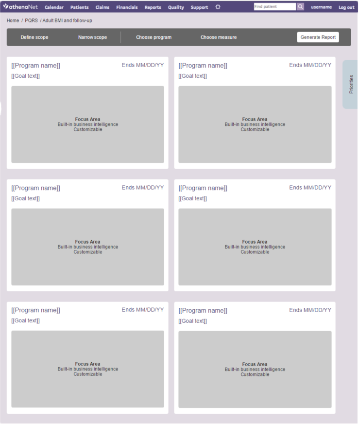
The first wireframe that I made was for the deepest level to which a user could drill down. This helped me better understand the various levels of granularity of information; the most granular information was found here, so the other levels couldn't be as specific.
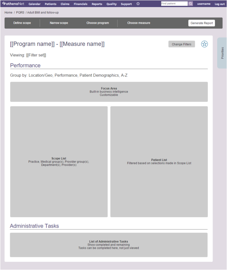
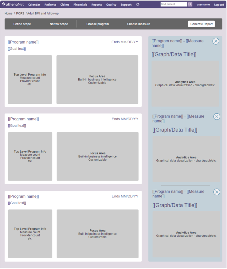
This included displaying business intelligence, a list of the information being viewed with its specific data to the right, and administrative tasks that the user needs to perform on the information presented at the bottom.
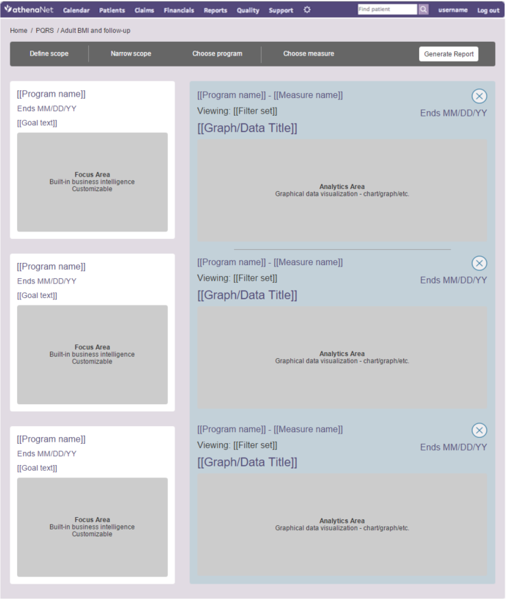
Here you can see the "Priorities" bin as a blue tab along the right edge of the mockup. Clicking it is how the user opens the "Priorities" bin.
I then decided to flesh-out what exactly would go inside of the "Priorities" bin. Given the need for users to run a given report frequently or monitor the performance of a specific doctor or program, I made this a pure analytics area. Here users are able to create charts and filter the data going into them in real time. As screen real estate usage was and is very important, I made the bin responsive to allow for list (left) and grid (right) views of the analytics.
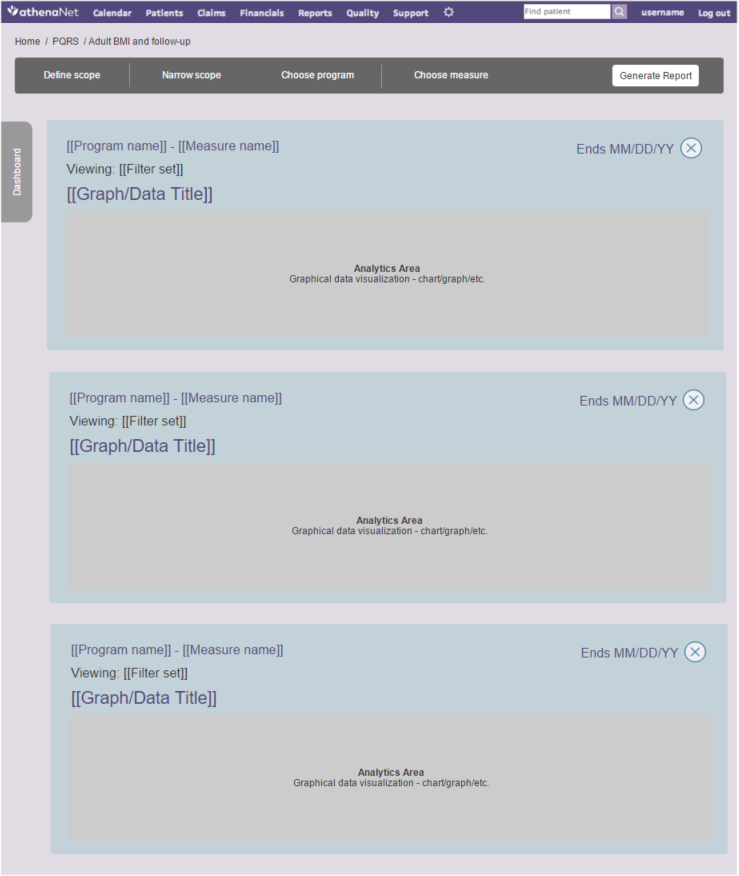
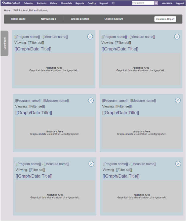
Here you see the "Dashboard" bin as a grey tab along the left edge of the mockup. Clicking it is how the user returns to the QMR page they were looking at before opening the "Priorities" bin.
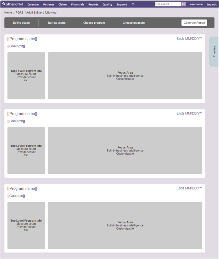
With the deepest level of granularity and the "Priorities" bin wireframed, it was time to wireframe the highest level of actionable information, the home page. Instead of showing the user very specific data points, here they would see high-level summaries alongside a customizable specific piece of information from deeper within the information hierarchy. I carried over the same responsive design principles from the "Priorities" bin above.
Finally, it was time to merge the "Dashboard" and the "Priorities" bin together, allowing the user to view them at the same time. This opened up countless opportunities for users to compare information from different areas of the QMR side-by-side.
Here's what the heads up was about
I created designs based on these wireframes, but unfortunately I can't show them here.
Design Studio Feedback
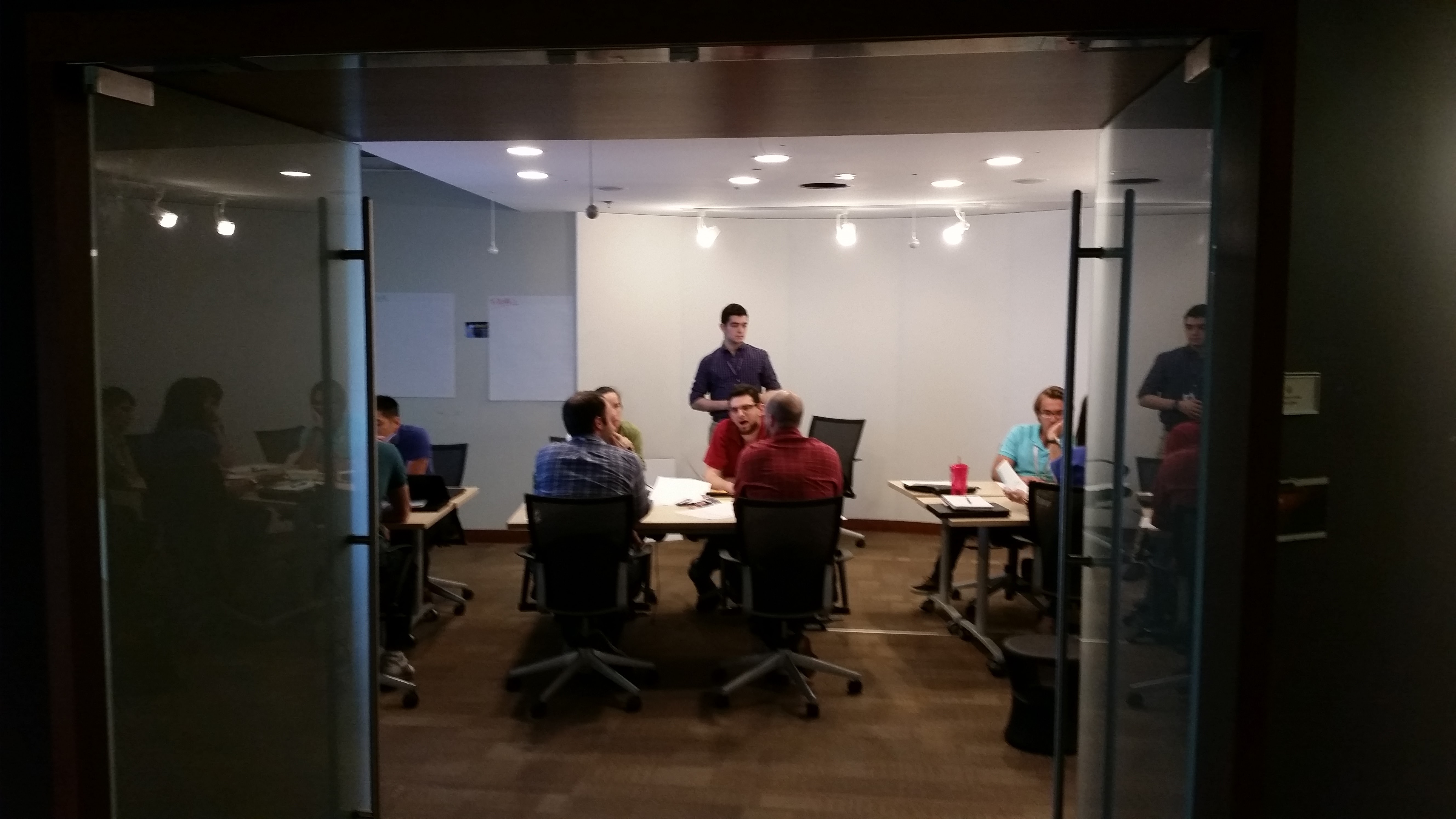
Once I made my wireframes and initial designs, I ran a design studio to see what other people's ideas were and if I was heading in the right direction. I coordinated a cross-functional R&D team comprised of designers, developers, project managers, and client-facing stakeholders to participate, and the results were amazing. I gave them the context of the project, showed them the inspiration that I had gathered, and tasked them to think of and draw out solutions on paper. They then shared their ideas in groups, with each group given the task of using its individuals' ideas to create one final design together. The groups then presented their designs to one another.
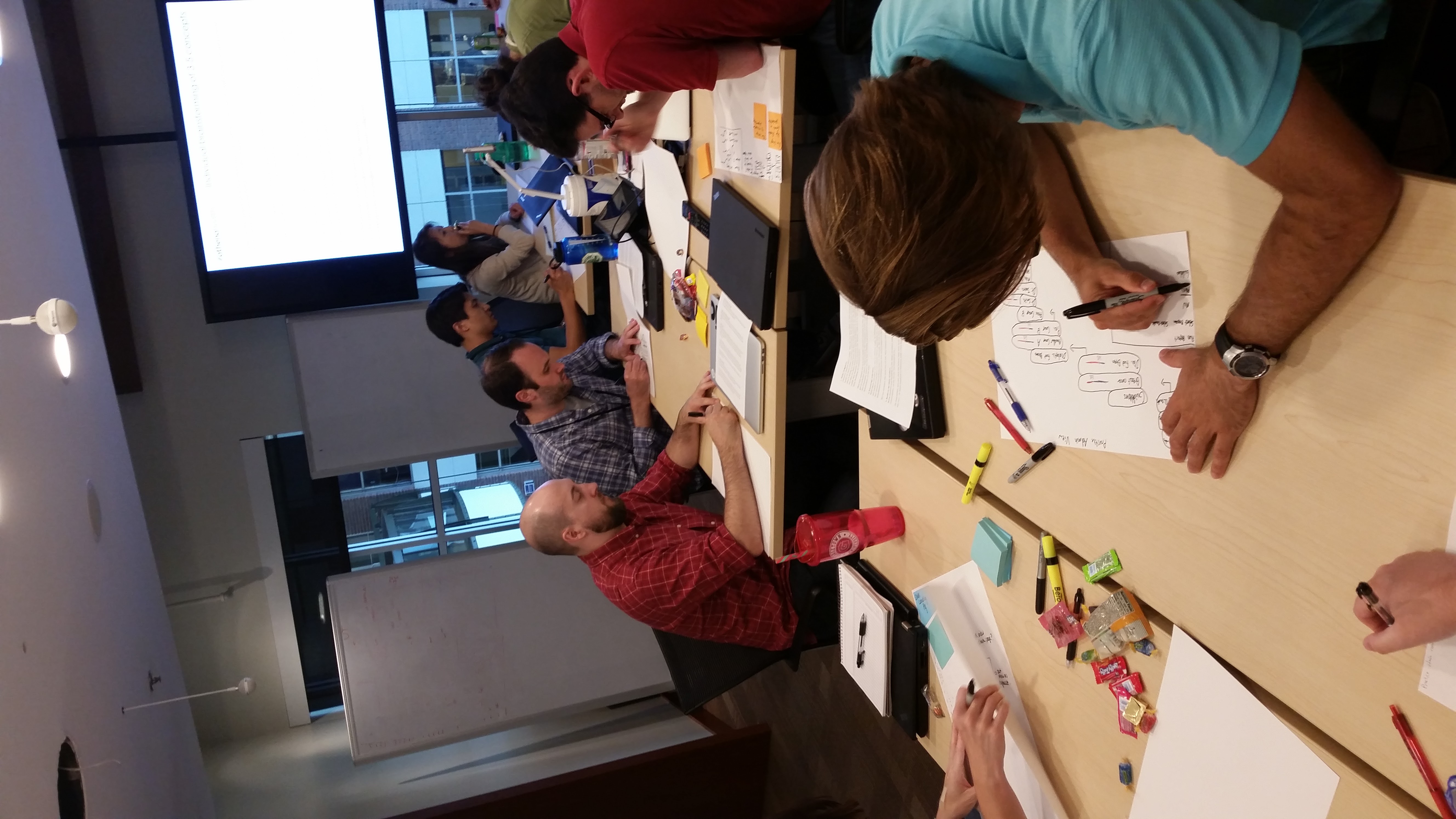
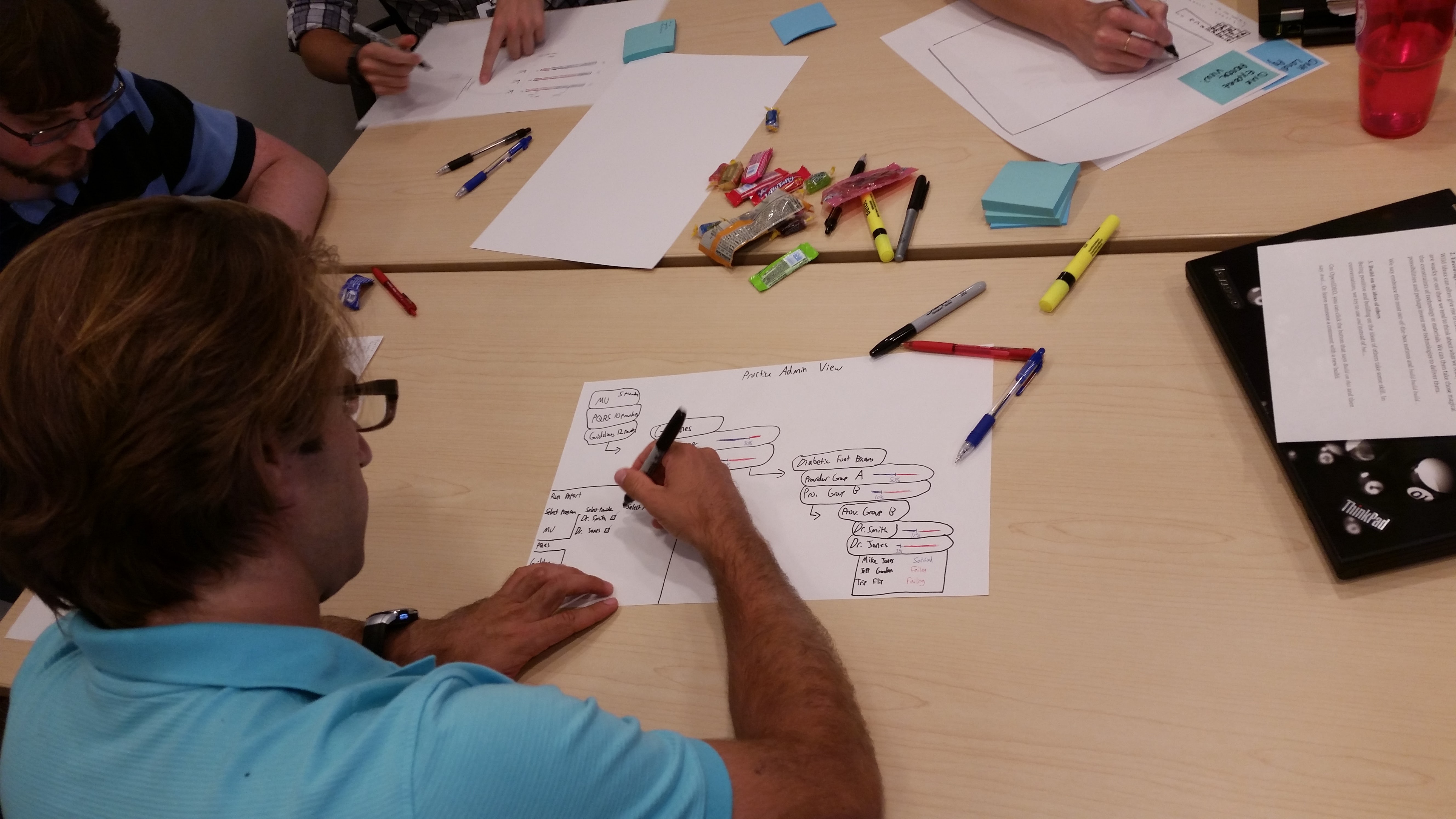
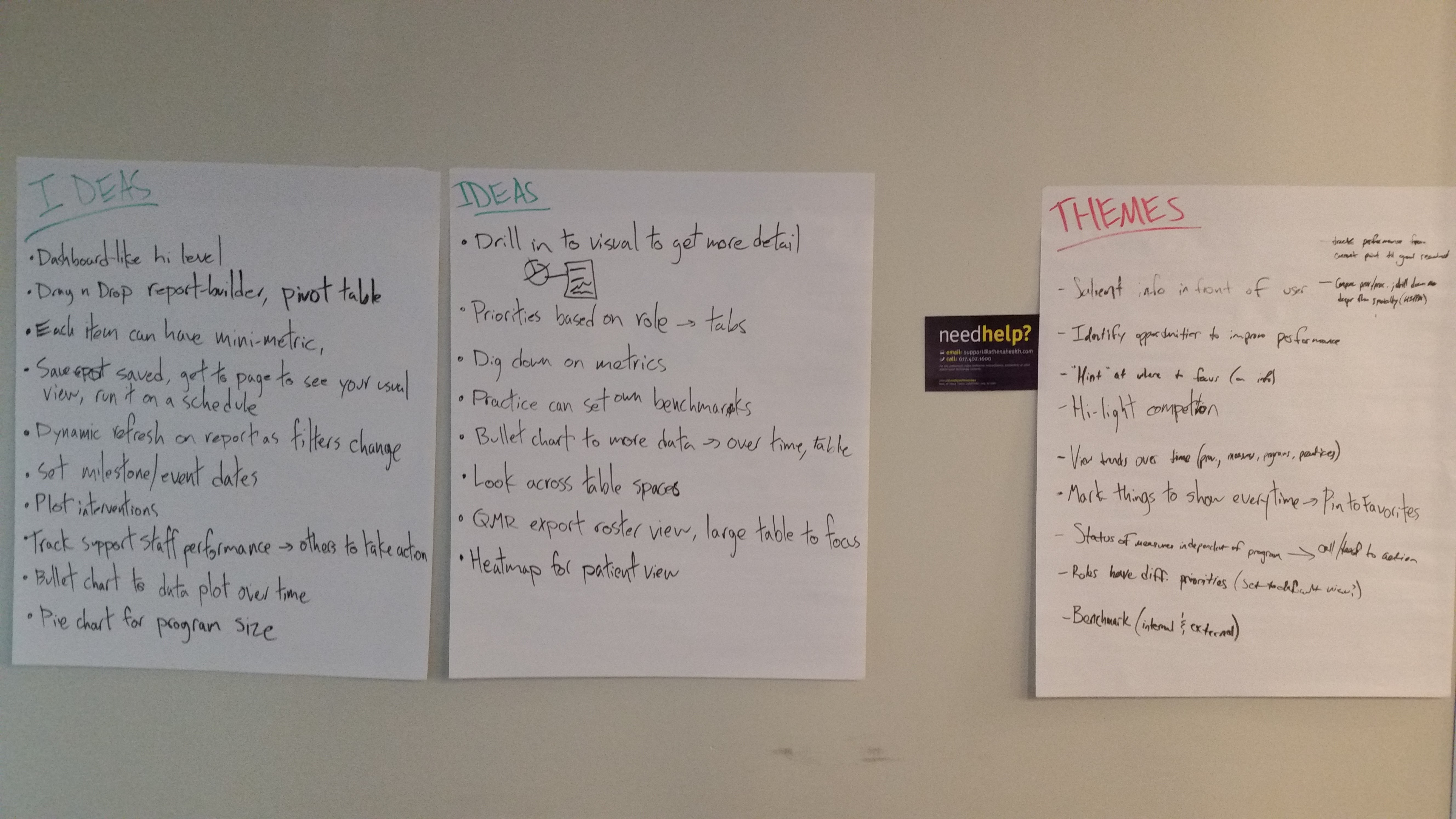
The design studio went very well. Everyone who participated told me that they enjoyed being part of the process. The ideas that they came up with validated what I had already thought of and provided great new insights into the user experience of the product. I ended up using some of the design elements that came from the design studio, which ultimately helped the product deliver meaningful analytics.
Final Design
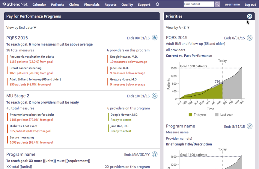
We started with an overview of performance statuses across all programs in which the practice was participating to identify areas to dig deeper.
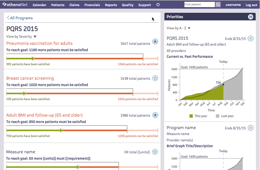
Then we dove into specific program performance data.
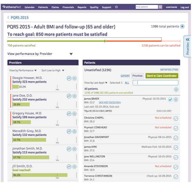
Finally, we drilled down into specific performance measures, showing doctors' performance and patient lists to make it easy to contact patients.
My work on the QMR was very well received and set the vision for integrating the similar existing products into a powerful analytics and reporting ecosystem. At the time, this project was expected to take a few years to complete given its magnitude.
Biggest Takeaways
- Improve by rapidly iterating and refining with your team
- Always understand the limitations of a project, in this case regarding resources and information infrastructure
- Start with a concept, broaden your scope and gather ideas, then hone in