Timeline
2 Weeks
June 1 – 12, 2014
Context
Autodesk's Home & Building Platform ecosystem was disjointed with five interconnected products revolving around home interior design. The company had just decided how it would link between products to turn it into an ecosystem and wanted to build a webpage to communicate their vision.
Problem
These are five completely separate products, right?
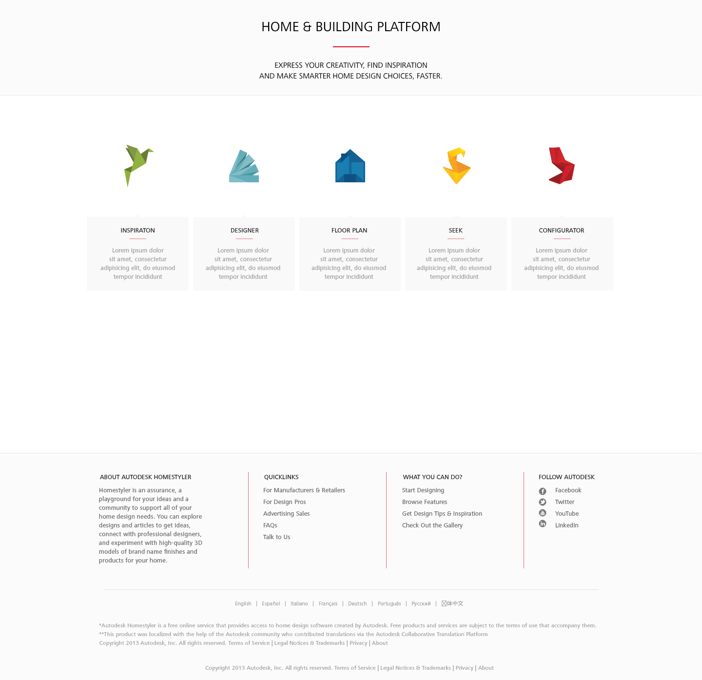
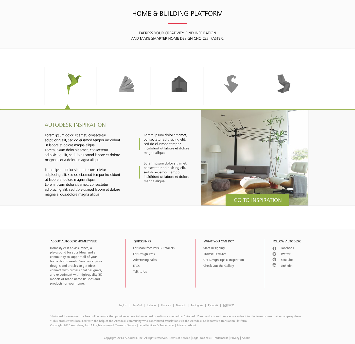
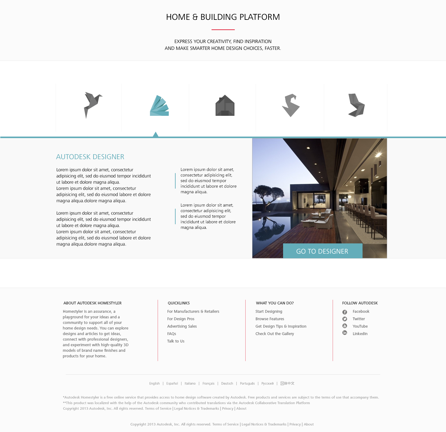
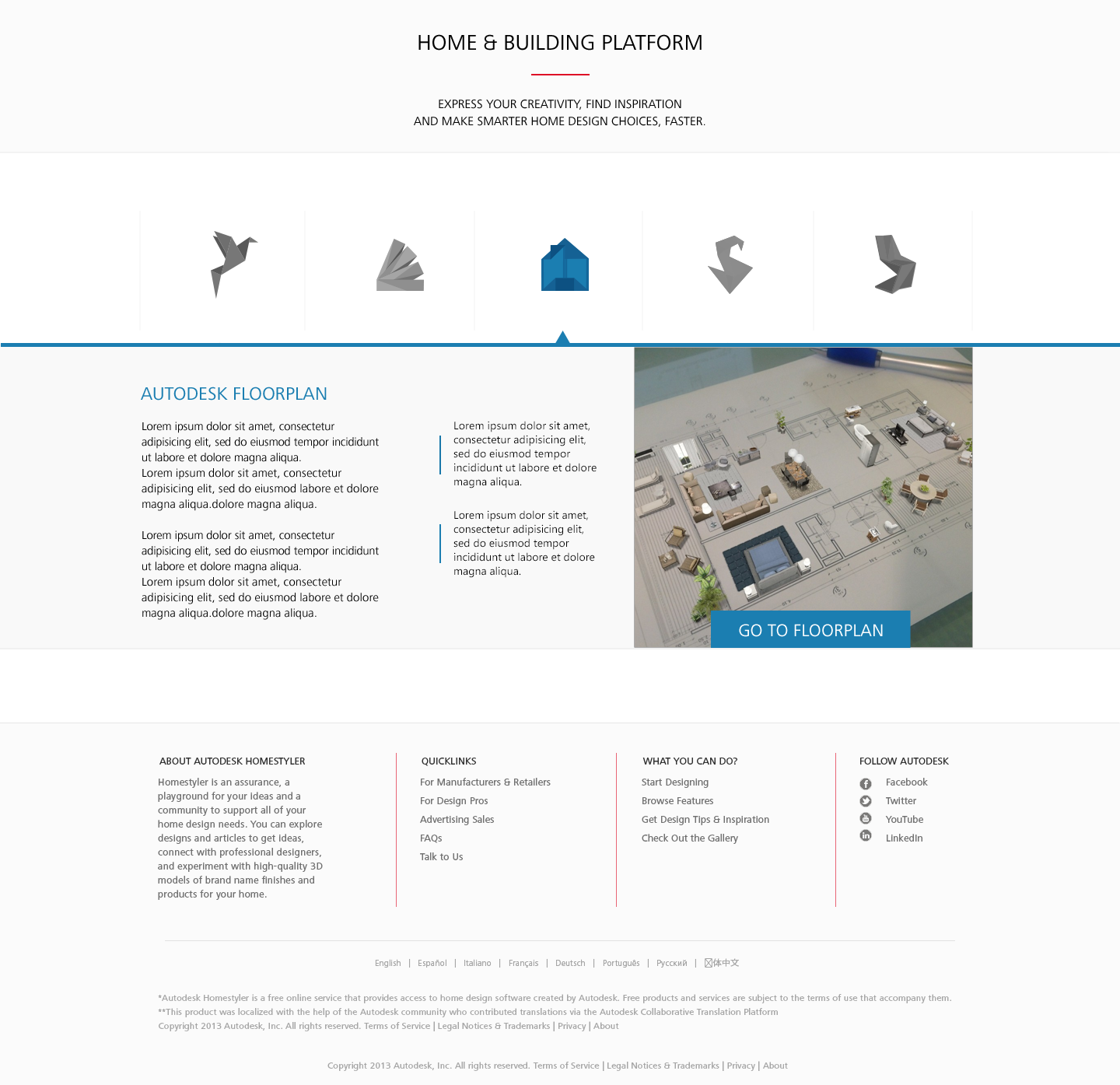
Consumers were unaware that Autodesk's five Home & Building Platform products were designed to be used together. To explain to users that these five products worked together, the company decided to build a website landing page for the ecosystem. The purpose was to showcase what each product had to offer in relation to one another.
There isn't a single website that clearly describes the ecosystem.
The Home & Building Platform didn't have its own webpage. Autodesk wanted a clear expression of this ecosystem, and it felt that the best way to do this was to release a webpage.
The design of the existing product websites looks a bit outdated.
The existing webpages had a 3-dimensional glass-style design aesthetic. To make the ecosystem page look and feel current, we decided to use a 2-dimensional flat design aesthetic and design a new and effective user experience.
Process
Research Current Web Presence
Since one of the goals of the project was to improve the web presence of our ecosystem, I researched our websites to identify areas for improvement and things to keep. I also looked into competitors' websites to see what we were up against.
I found that each of our products had their own websites with unique user interfaces and experiences. I also noticed that competitors had fairly plain websites with minimal interactions.
I decided that as an ecosystem, the UI/UX would be consistent for each product. It was also important for users to have an interactive experience with the information on the site – interactive content would not only excite users, but it would serve as a differentiating factor against competitors.
Design Aesthetic
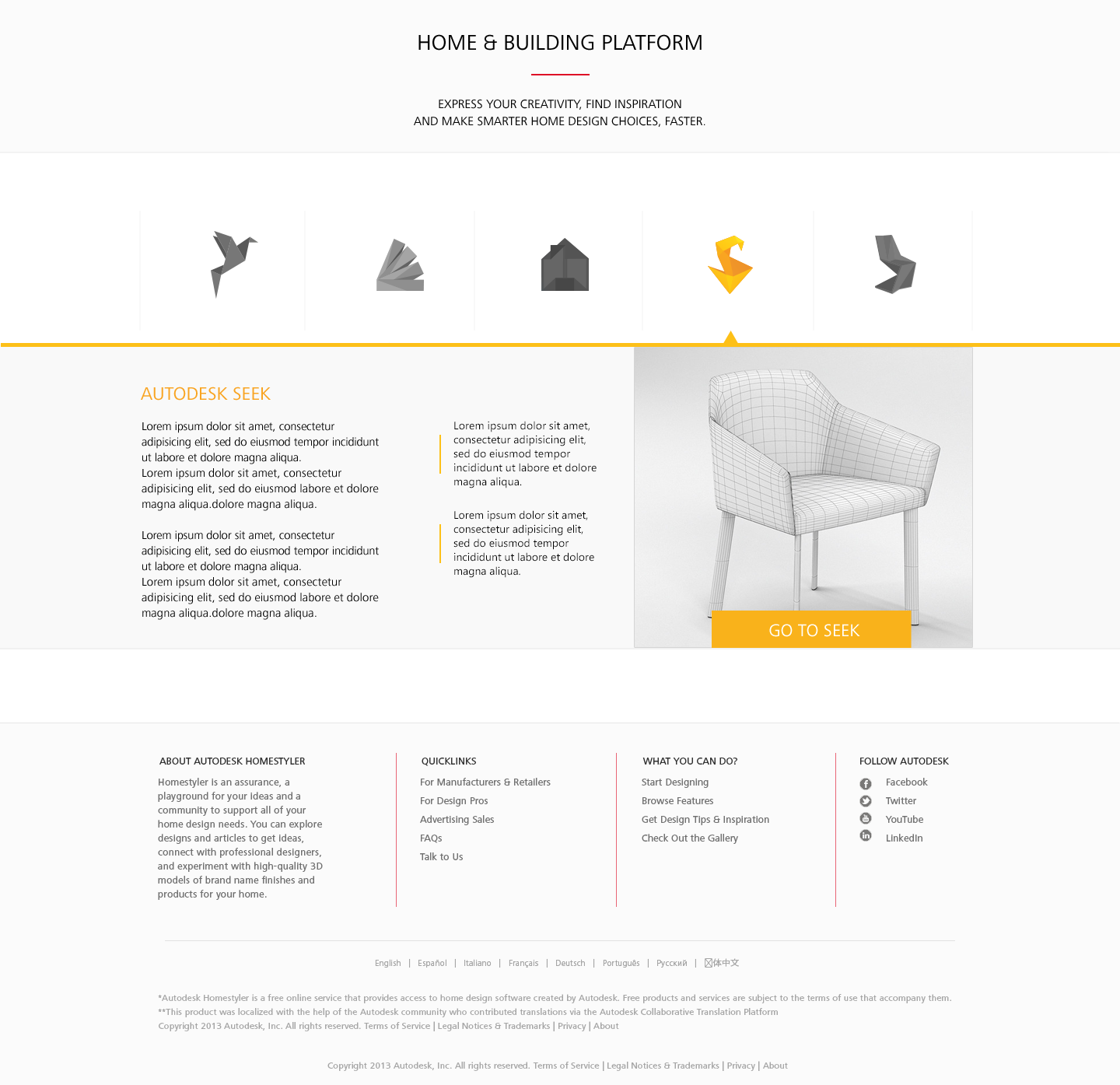
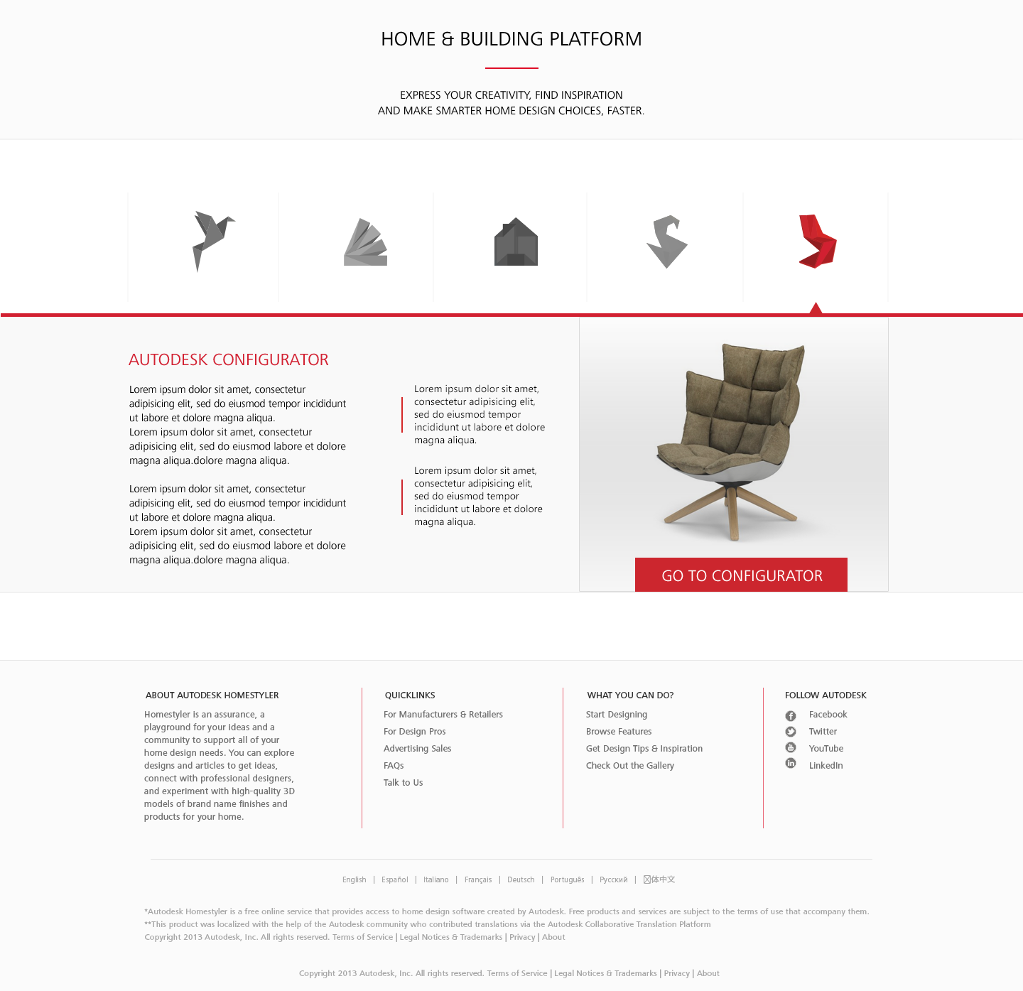
The existing design aesthetic needed to be updated from its 3-dimensional iconography and backgrounds. I changed to a flat 2-dimensional design, which involved creating new logos, changing the color palette to use bold single colors as accents, and ensuring that the layout kept elements on the same depth level.
Each product already had its own primary color, and Autodesk had a global footer for all of its products and webpages, which were important things to carry over into the new design.
Arriving on the page presents the user with all five products, each of which displays more information and an action item on hover.
Feedback
Throughout the process, my team provided feedback on my design, guiding me towards making it as impactful as possible. They were great to run ideas by – having been at the company for much longer than me, they shared very helpful insights.
Final Design
If you would like to see more of the design, let me know – I'm unable to put it all on the public Internet.
Biggest Takeaways
- Prototyping with a tool like Photoshop can be more efficient than coding from scratch
- Redesign is not synonymous with "everything is new" – carrying over primary/relevant aesthetics from the original design helps make the new design feel familiar
- Bouncing ideas off of veteran employees helps to keep more drastic changes in check